Android animation is a powerful tool for creating visually appealing and interactive UI effects in your Android applications. With animation, you can bring your user interface to life, adding smooth transitions, transformations, and other engaging effects. This creates a more immersive and delightful user experience.
The Android SDK provides a rich set of animation capabilities that you can leverage to enhance your app's UI. You can apply animations to various UI elements such as views, layouts, and widgets to achieve a wide range of effects like fading, scaling, rotating, translating, and more.
Fri, 16 Jun 2023
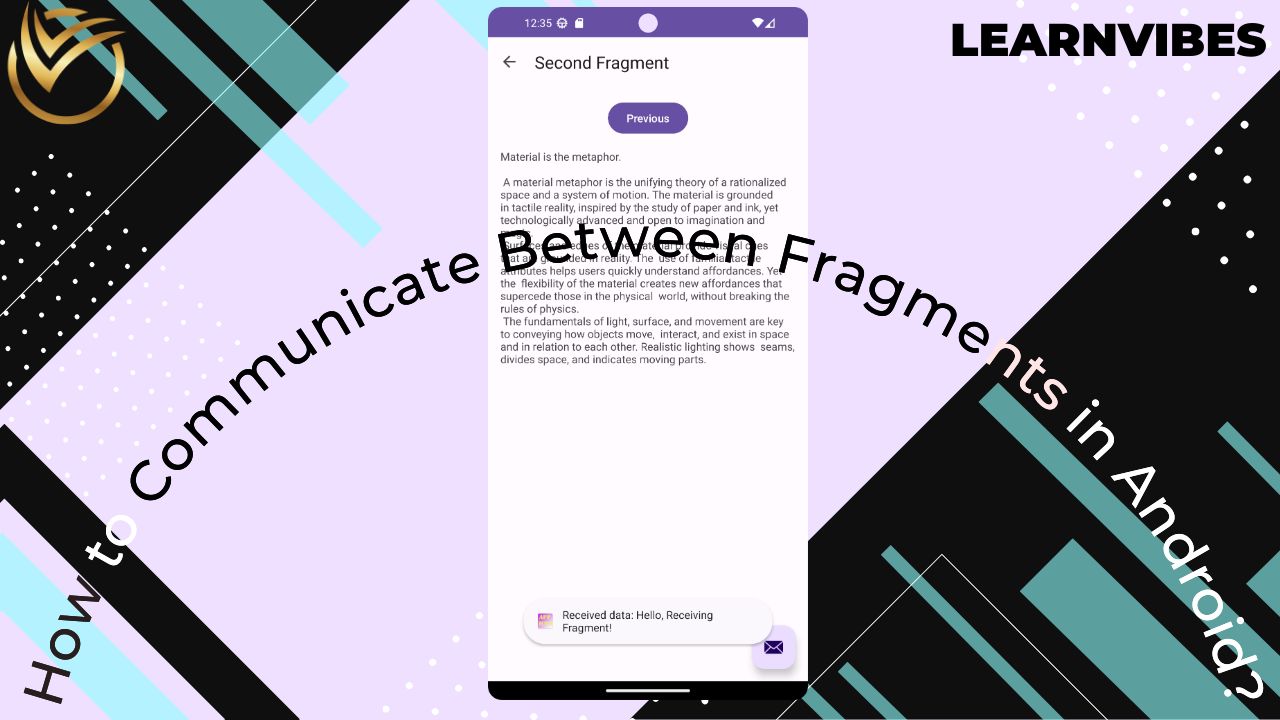
In Android Studio, communicating between fragments is a common requirement when building complex applications. Fragments are modular components of an Android app that can be reused and combined to create a dynamic user interface. To facilitate communication between fragments, there are several approaches you can take:
Tue, 11 Jul 2023
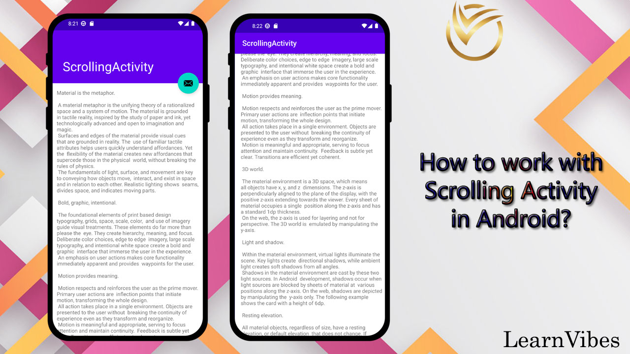
In Android app development, implementing a scrolling activity is a common requirement when you have a layout that exceeds the screen's visible area. Scrolling activities allow users to scroll through content vertically or horizontally, ensuring that all information is accessible within a confined space.
In this tutorial, we will explore how to create a scrolling activity in Android. We'll cover the necessary steps to set up a scrolling layout, enable scrolling behavior, and customize the scrolling experience. Additionally, we'll discuss different types of scrolling, such as vertical and horizontal scrolling, and demonstrate how to implement them.
Fri, 30 Jun 2023
The ActionBar, also known as the Toolbar, is a crucial component of Android apps that provides a consistent and customizable way to present key actions and information to users. It serves as a primary navigation and control element in the app's user interface.
Adding a Toolbar to your Android app in Android Studio using Java involves a few simple steps. By following these steps, you can integrate a Toolbar and enhance your app's user experience by providing a feature-rich ActionBar.
Tue, 13 Jun 2023
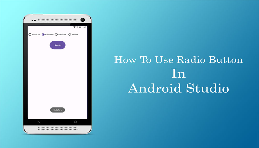
In this tutorial, we'll walk you through the entire process of working with Radio Buttons in Android. You'll learn how to incorporate Radio Buttons into your app's UI, allowing users to choose a single option from a group of choices that are mutually exclusive. We'll start by introducing Radio Buttons and their significance in creating dynamic user interfaces. You'll gain a clear understanding of their purpose and how they contribute to a seamless user experience.
Tue, 06 Jun 2023
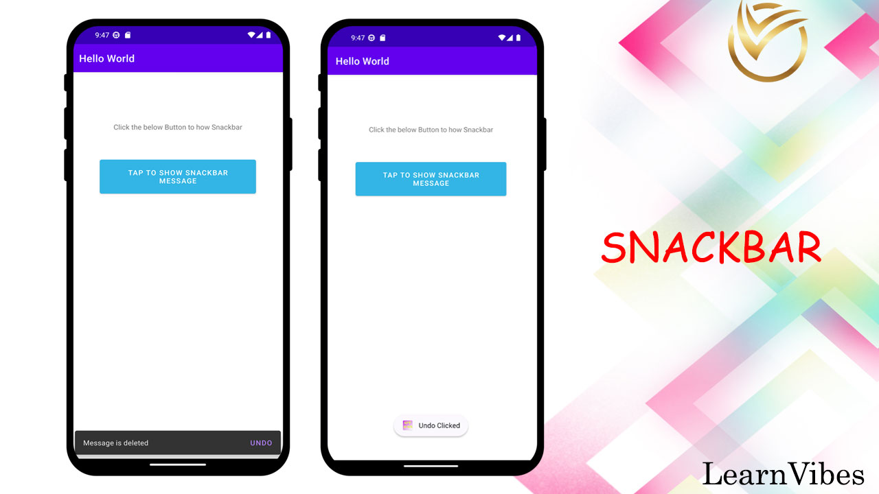
Snackbar is a component in Android that provides a lightweight and non-intrusive way to display short messages or notifications to the user. It is typically used to show messages that are important but not critical, such as a confirmation message or a simple status update. Snackbars are displayed at the bottom of the screen and automatically disappear after a certain duration or when the user dismisses them.
Mon, 03 Jul 2023
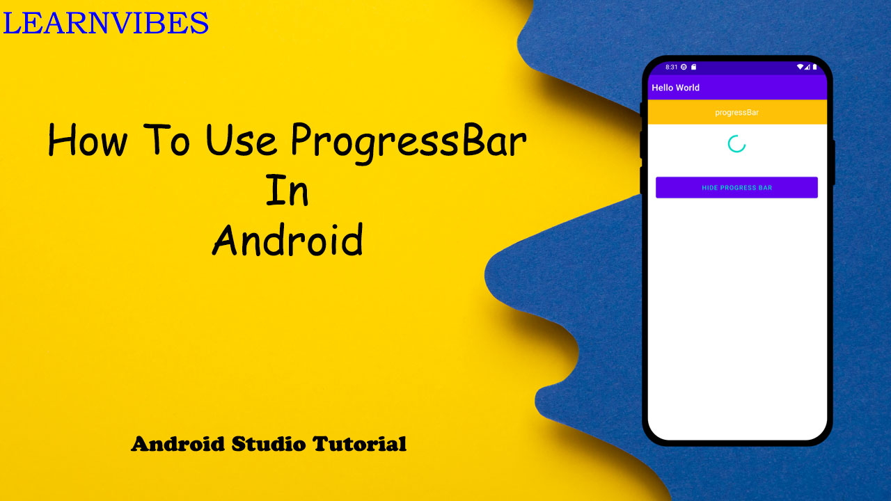
ProgressBar is a built-in widget in Android that provides visual feedback to the user about the progress of a particular task or operation. It is commonly used to indicate loading, file downloads, or any process that takes time to complete. The ProgressBar can be displayed in different styles such as horizontal (a progress bar that fills from left to right) or spinner (a circular indeterminate progress indicator).
Using ProgressBar in your Android application is a straightforward process. You start by adding the ProgressBar widget to your XML layout file, then initialize and reference it in your activity or fragment code. You can customize the appearance and behavior of the ProgressBar by setting attributes such as style, color, size, visibility, and progress value.
Once the ProgressBar is set up, you can update the progress dynamically based on your application logic. For determinate progress bars, you can set the progress value directly or increment it as the task progresses. For indeterminate progress bars, the animation automatically shows continuous progress without specifying a specific value.
Tue, 04 Jul 2023
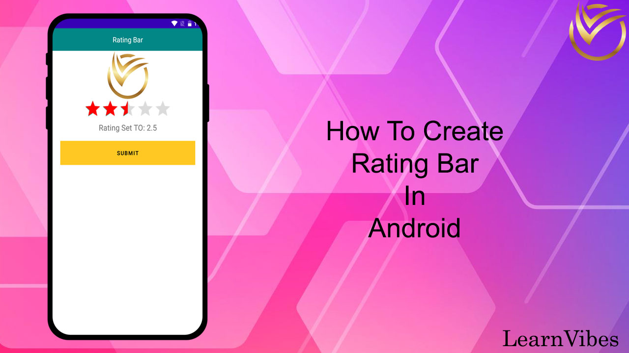
The RatingBar is a UI element in Android that allows users to rate or provide a numerical value to a specific item or feature. It consists of a series of stars or other symbols that users can interact with to indicate their rating. The RatingBar is commonly used in various types of apps, such as product review apps, movie rating apps, restaurant review apps, and more.
Creating a RatingBar in Android is straightforward and involves a few simple steps. By following these steps, you can quickly add a rating functionality to your app and allow users to express their opinions and feedback.
Thu, 22 Jun 2023
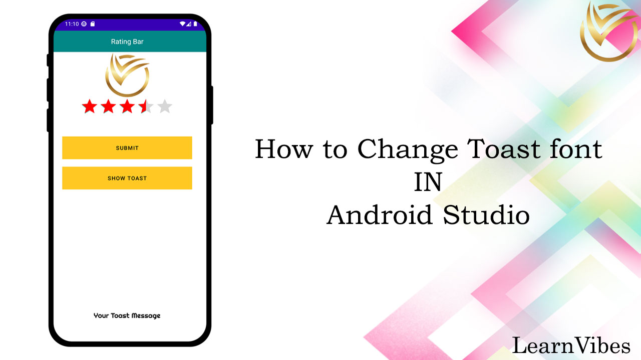
In Android, the Toast class does not provide a direct way to change the font. However, you can achieve the desired effect by creating a custom Toast layout and applying a custom Typeface (font) to the TextView within that layout. Here's how you can change the font of a Toast:
Fri, 23 Jun 2023
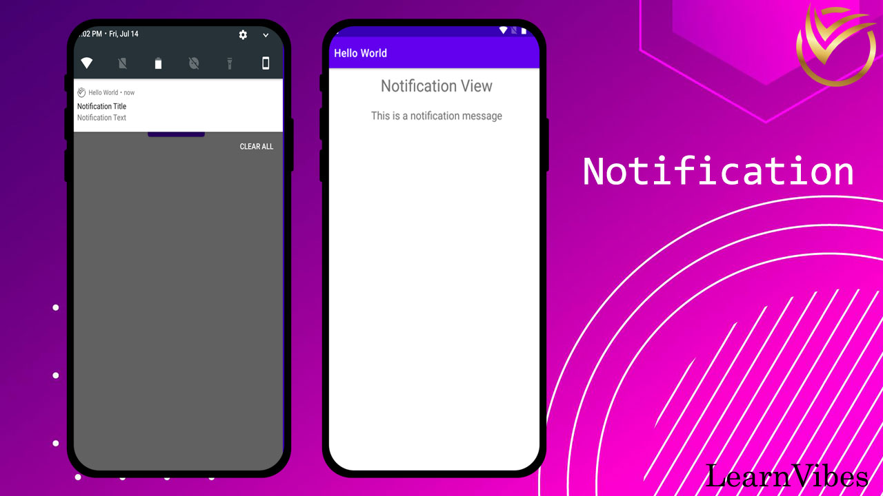
To display and manage notifications in Android, you can follow these general steps:
Fri, 14 Jul 2023
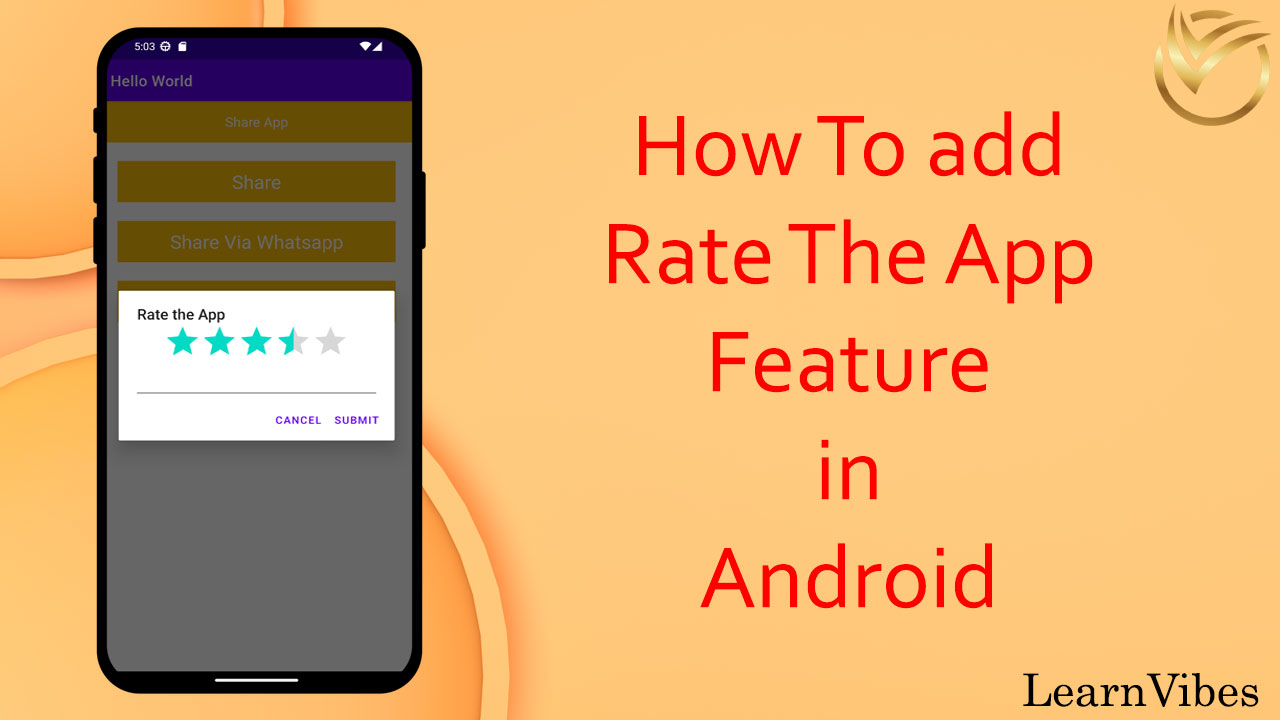
When you publish your app on the Google Play Store, it is crucial to receive feedback from users. However, users are not likely to go out of their way to rate your app unless they either love it or hate it. To encourage users to provide feedback, it's beneficial to include a "Rate Me" feature in your app. This feature serves several important purposes:
Sun, 09 Jul 2023
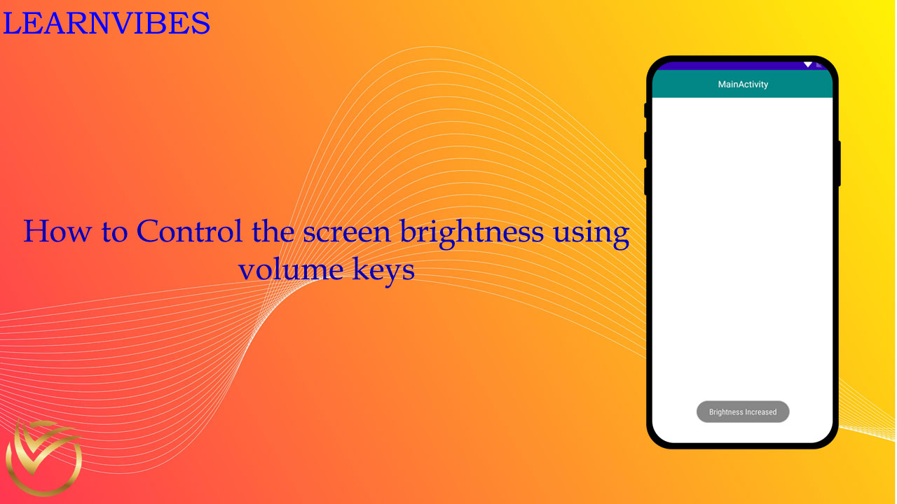
To increase or decrease screen brightness using volume keys programmatically in an Android app, you'll need to capture the volume key events and adjust the system screen brightness accordingly. Here's a step-by-step guide on how you can achieve this:
Tue, 27 Jun 2023
Using Image Views in Android Studio is a fundamental aspect of creating visually appealing and interactive user interfaces. In this tutorial, we will provide a comprehensive guide on how to effectively use Image Views in your Android app development.
Wed, 07 Jun 2023
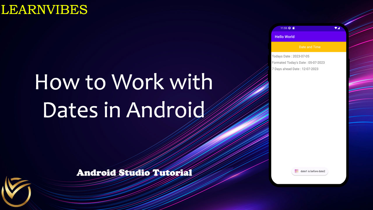
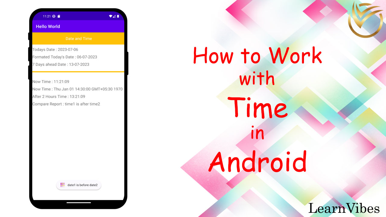
Working with dates in Android programmatically is a common task when developing mobile applications that involve scheduling, time-based operations, or displaying dates to users. Android provides a set of classes and utilities to handle dates and times effectively. Here's an introduction to working with dates in Android programmatically:
Wed, 05 Jul 2023
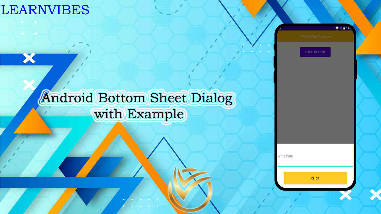
Android Bottom Sheet Dialogs offer a flexible and interactive way to present additional content or actions to users while maintaining context within an app. Similar to a dialog, a Bottom Sheet Dialog slides up from the bottom of the screen, partially covering the main content. It provides a sleek and modern user experience by allowing users to access secondary or contextual options without leaving the current screen.
In this tutorial, we will explore how to implement a Bottom Sheet Dialog in Android app development. We'll cover the essential steps to integrate a Bottom Sheet Dialog, including creating the dialog layout, handling user interactions, and customizing its appearance and behavior.
Thu, 29 Jun 2023
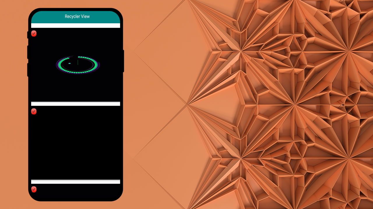
RecyclerView is a powerful and flexible UI component in Android Studio that allows you to efficiently display large sets of data in a scrollable list or grid. It is often used in conjunction with a custom adapter to bind data to individual items within the RecyclerView.
When working with RecyclerView, it is common to use a model class to represent the data for each item. The model class encapsulates the properties and behaviors of an item, allowing you to organize and manipulate your data more effectively.
Sat, 10 Jun 2023
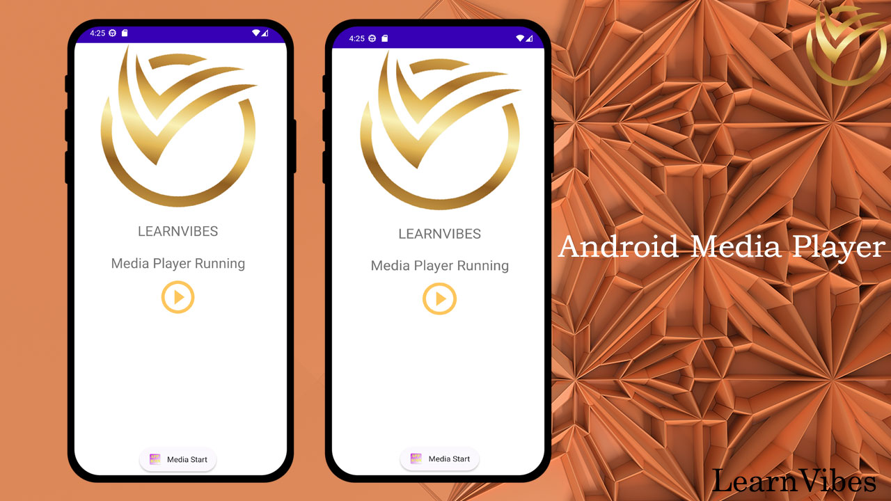
The MediaPlayer class in Android provides a flexible framework for playing audio and video files. It allows you to handle various media-related operations such as playing, pausing, seeking, and controlling the playback of media files.
Sat, 24 Jun 2023
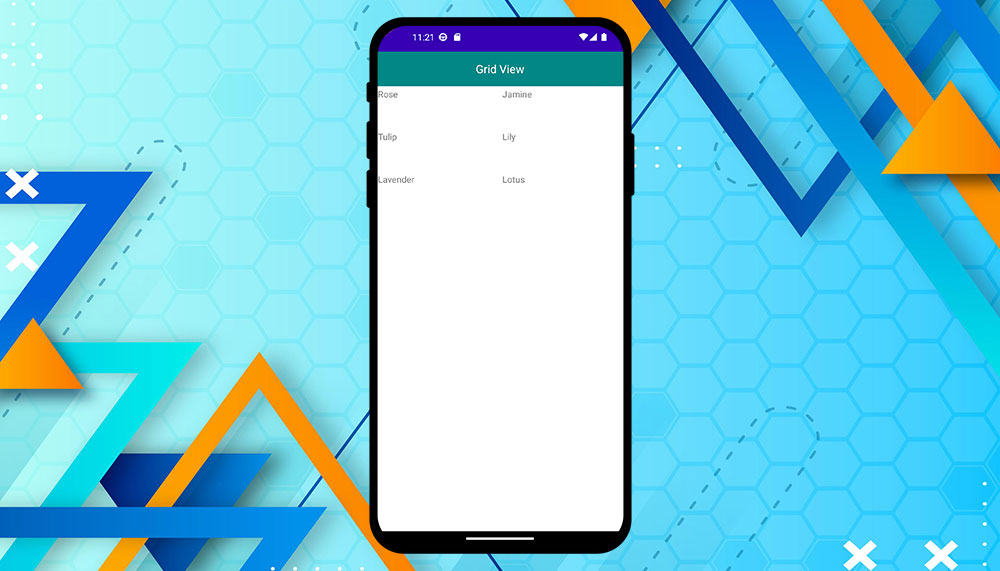
In Android Studio, GridView is a UI component that displays items in a grid format. It is a view group that allows you to organize data, typically images or text, in rows and columns. GridView provides a convenient way to present data in a grid-like layout, allowing users to scroll through the items horizontally and vertically.
GridView consists of a set of cells, where each cell represents an item in the grid. By default, GridView automatically arranges the items based on the available space, resizing and positioning them accordingly. It also supports features like item selection, item click events, and scrolling.
GridView is commonly used in various scenarios, such as displaying image galleries, product catalogs, or any type of data that needs to be presented in a grid format. It offers flexibility in customizing the appearance of the items, allowing you to create visually appealing and interactive interfaces.
To use GridView in Android Studio, you need to define it in the XML layout file and then set up an adapter to populate it with data. The adapter is responsible for creating the views for each item in the grid and binding the data to them. You can also customize the layout and behavior of the GridView by specifying attributes like the number of columns, column width, and spacing.
Overall, GridView is a versatile and powerful component in Android Studio that simplifies the implementation of grid-based layouts, making it easier to showcase and navigate through collections of items in your Android applications.
Fri, 09 Jun 2023
Parsing local JSON files in Android is a common task when you want to retrieve data stored in a JSON format from your app's assets folder. JSON (JavaScript Object Notation) is a lightweight data interchange format that is easy to read and write.
Parsing a local JSON file involves reading the file from the assets folder, extracting the data from the JSON structure, and using it in your Android application. This process typically involves the following steps:
Sat, 15 Jul 2023
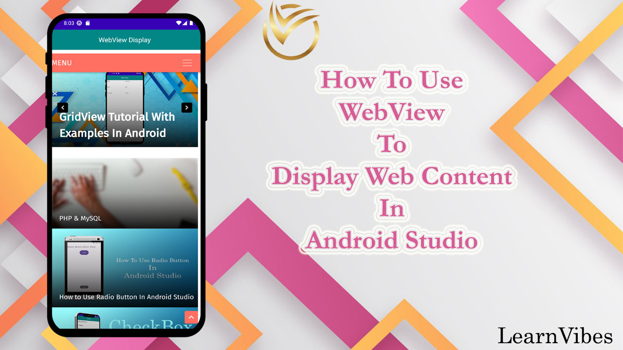
Android WebView is a powerful component that allows you to embed web content within your Android application. With WebView, you can display web pages, load online resources, interact with web-based functionalities, and provide a seamless browsing experience to your app users.
Using Android WebView in Android Studio using Java involves a few simple steps. By following these steps, you can integrate WebView into your app and display web content efficiently.
To use Android WebView to display web content in Android Studio, you can follow these steps:
Mon, 12 Jun 2023
Working with time in Android programmatically is essential for various tasks such as scheduling, tracking events, and displaying time-based information in your application. Android provides a range of classes and utilities to help you work with time effectively. Here's an introduction to correctly working with time in an Android program:
Thu, 06 Jul 2023
AlertDialog is a common UI component in Android applications that allows you to display important information, prompt user input, or present various options to the user. It is often used to convey critical messages or to obtain user confirmation for certain actions.
Creating an AlertDialog in Android Studio using Java is a straightforward process that involves a few simple steps. By following these steps, you can easily integrate AlertDialog into your Android application.
Sun, 11 Jun 2023
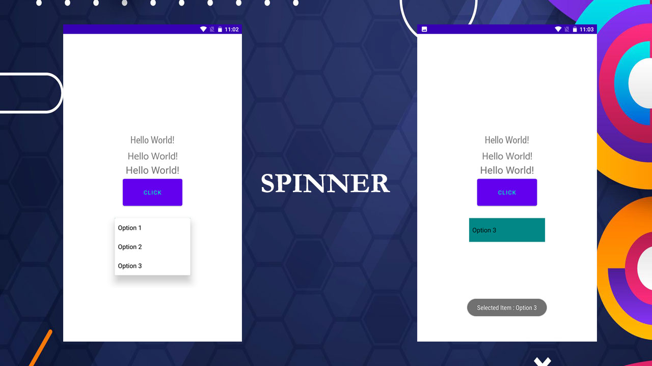
Android Spinners provide a user-friendly way to select an item from a predefined list. They are commonly used in forms, settings menus, and various other parts of an Android application. In this tutorial, we will walk you through the process of creating an Android Spinner from scratch. By the end, you'll have the knowledge to incorporate this interactive component into your own Android app.
Wed, 14 Jun 2023
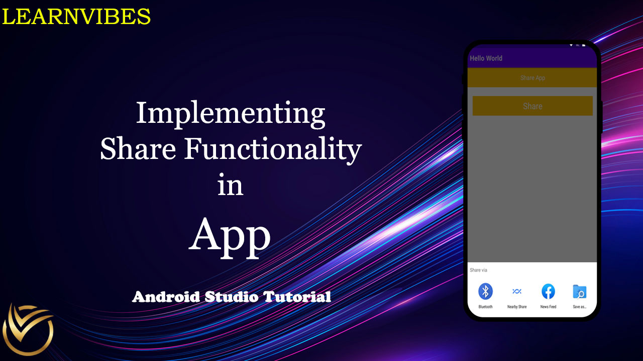
Implementing share functionality in an Android app allows users to easily share content from your app with other apps or contacts. This feature is useful for sharing text, images, links, or any other type of content with various social media platforms, messaging apps, or email.
To enable sharing in your Android app, you need to create an intent, specify the content to share, and start the activity chooser. The intent represents the action of sharing and contains the content you want to share. The activity chooser is a system dialog that presents the user with a list of apps capable of handling the share intent.
Sat, 08 Jul 2023
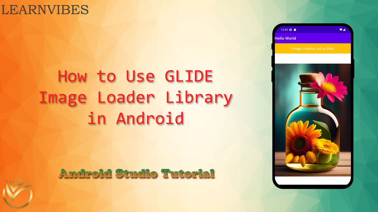
Glide is a popular image-loading and caching library for Android apps. It simplifies the process of fetching, resizing, and displaying images efficiently. With Glide, you can load images from various sources such as URLs, local files, or even resources, and apply transformations to them.
To use the Glide image loading library in your Android app, follow these steps:
Thu, 13 Jul 2023
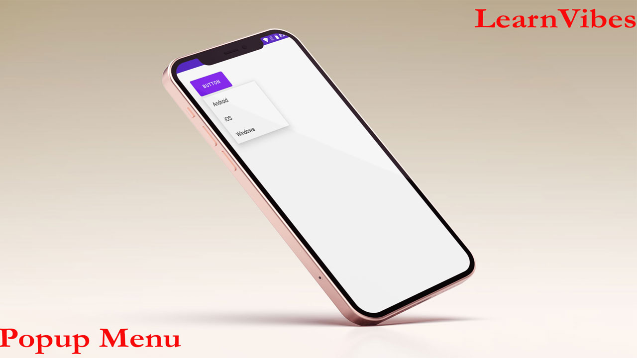
Popup Menu is a UI component in Android that displays a list of menu items in a dropdown fashion. It is typically used to provide a set of actions or options that are contextually relevant to a specific view or event. When triggered, the Popup Menu appears as a floating window, allowing the user to select an item from the available options.
Popup Menu is commonly used in scenarios where there is limited space available or when you want to provide a focused set of choices to the user without cluttering the main UI. It is often associated with user actions such as button clicks, long presses, or right clicks.
Key features of Popup Menu in Android include:
Contextual display: Popup Menu appears near the triggering view, creating a contextually relevant menu for the user.
Customizable appearance: You can customize the appearance of the Popup Menu by applying different themes, styles, or color schemes to match your app's design.
Dynamic menu items: Popup Menu allows you to dynamically add, remove, or modify menu items based on the current state or context of your application.
Event handling: You can define actions to be performed when a menu item is selected using event listeners.
To create a Popup Menu in Android, you typically define the menu items in an XML file, inflate the menu layout in your code, handle menu item clicks, and associate the Popup Menu with the appropriate view or event.
By utilizing Popup Menu, you can enhance the user experience by providing a convenient and focused way for users to access relevant actions or options within your Android application.
Thu, 15 Jun 2023
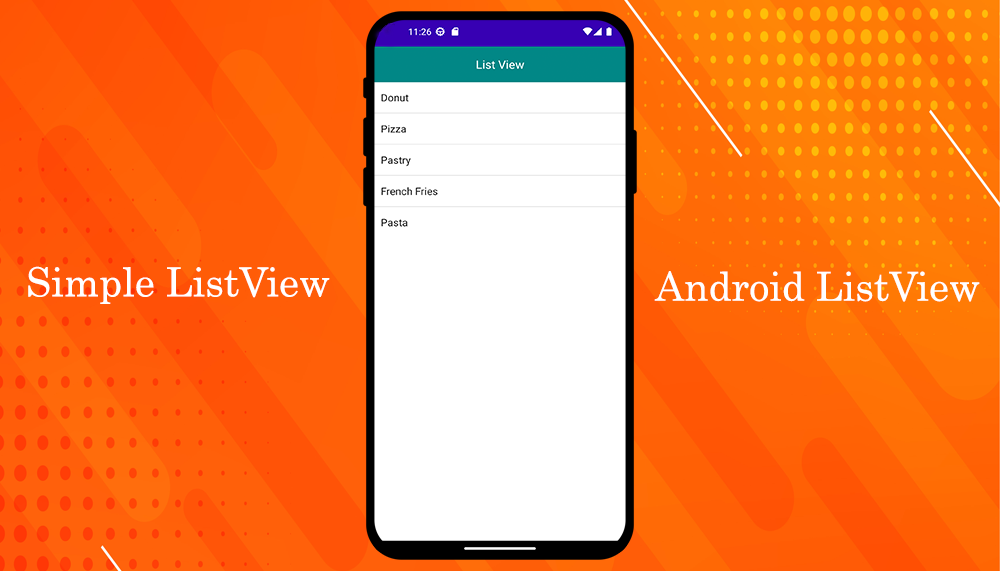
ListView is a fundamental UI component in Android that allows you to display a scrollable list of items. It is commonly used to present data in a vertical list format, making it ideal for showcasing various types of content, such as text, images, or a combination of both.
The ListView widget provides a flexible and efficient way to handle large datasets and interact with individual list items. It automatically handles scrolling and view recycling to optimizing memory usage and performance. ListView also supports features like item selection, item click events, and custom item layouts.
Thu, 08 Jun 2023
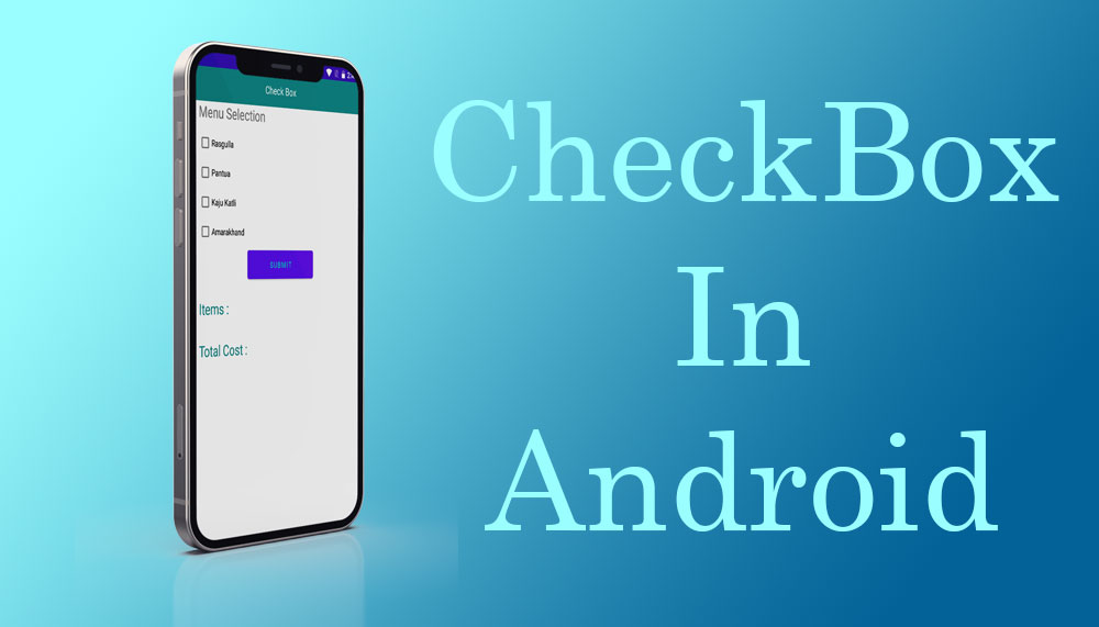
An Android Checkbox is a user interface component that allows users to make multiple selections from a list of options. It is a type of widget or view that represents a binary choice, where users can either select or deselect an option.
Tue, 06 Jun 2023
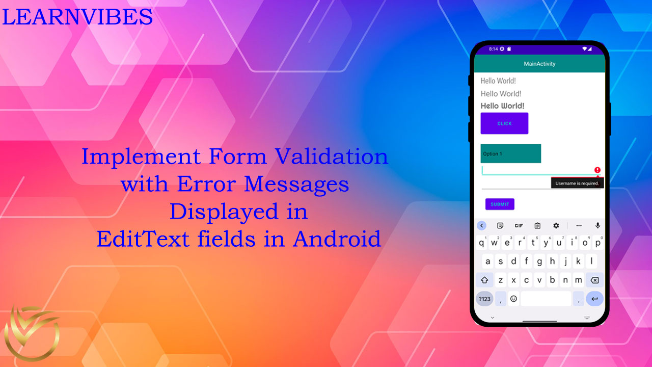
When developing Android applications, it's crucial to ensure that user input is validated before processing or submitting the data. Form validation plays a significant role in creating a seamless user experience and maintaining data integrity. By validating user input, we can ensure that the data meets specific criteria and provide helpful error messages to guide users in correcting any mistakes.
Mon, 26 Jun 2023
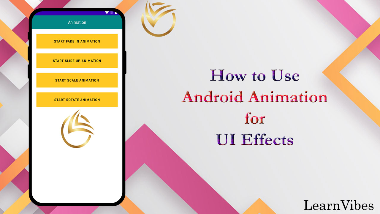
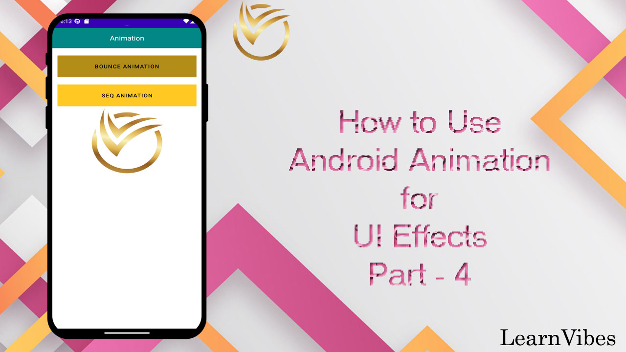
Android animation is a powerful tool that allows developers to add visual effects and interactive elements to their user interfaces. With animation, you can bring your app to life, engage users, and provide a more immersive experience. Whether it's a simple fade-in effect, a smooth transition between screens, or a complex set of movements, Android animation offers a wide range of options to enhance your app's look and feel.
Using animation in Android involves creating animations using XML or programmatically applying animations to various UI elements. XML-based animations provide a declarative way to define the animation properties, such as duration, interpolation, and target elements. On the other hand, programmatic animations give you more control over the animation behavior and allow for dynamic customization.
Tue, 20 Jun 2023
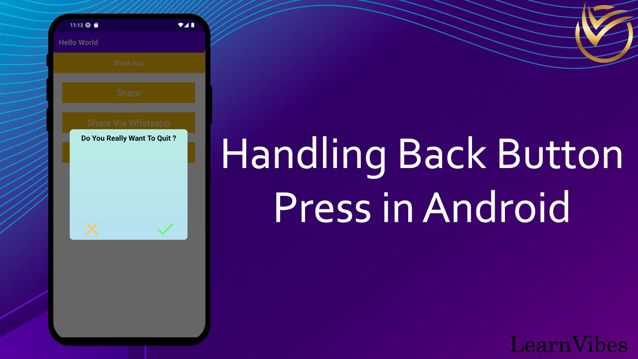
In Android, the back button is a common navigation feature available on most Android devices. By default, when the back button is pressed, the system navigates back to the previous screen or closes the current activity if there is no previous screen.
However, in some cases, you may want to customize the behavior of the back button to perform specific actions or implement custom navigation logic. This could include tasks like displaying a confirmation dialog, navigating to a different screen, or handling complex navigation flows within your app.
Mon, 10 Jul 2023
To obtain the SHA-1 fingerprint for your Android app in Android Studio, you can use the following steps:
Thu, 20 Jul 2023
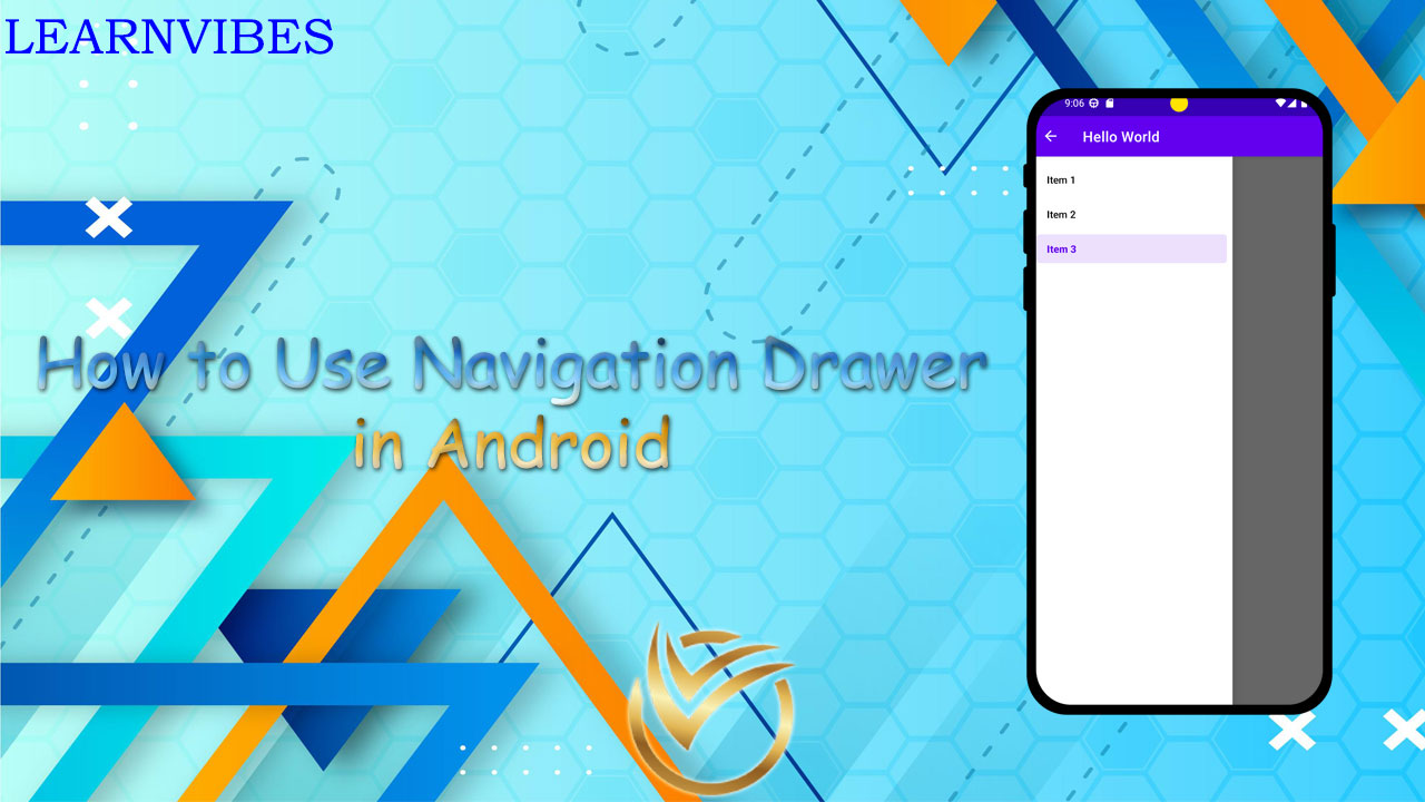
The navigation drawer is a common UI pattern used in Android apps to provide a user-friendly way to navigate between different sections or destinations within the app. It typically slides in from the left edge of the screen, revealing a menu or list of options for the user to choose from. The DrawerLayout class, provided by the AndroidX library, is the key component used to implement the navigation drawer functionality.
To create a navigation drawer using DrawerLayout in Android, you start by designing the layout for the navigation drawer itself. This layout defines the appearance and content of the drawer, such as a list of menu items, icons, or custom views. You can use NavigationView, provided by the Material Components library, as the root view for the navigation drawer layout.
Sun, 02 Jul 2023
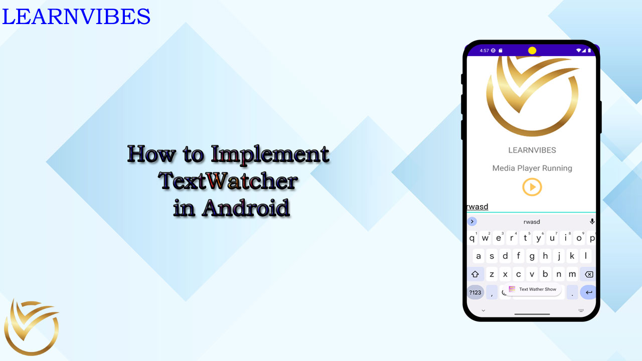
In Android development, efficiently handling user input is crucial for creating engaging and interactive applications. The TextWatcher interface provides a powerful tool for monitoring and responding to changes in text input fields. Whether you want to validate user input, dynamically update UI elements, or perform real-time filtering, TextWatcher offers a flexible and effective solution.
Sun, 25 Jun 2023
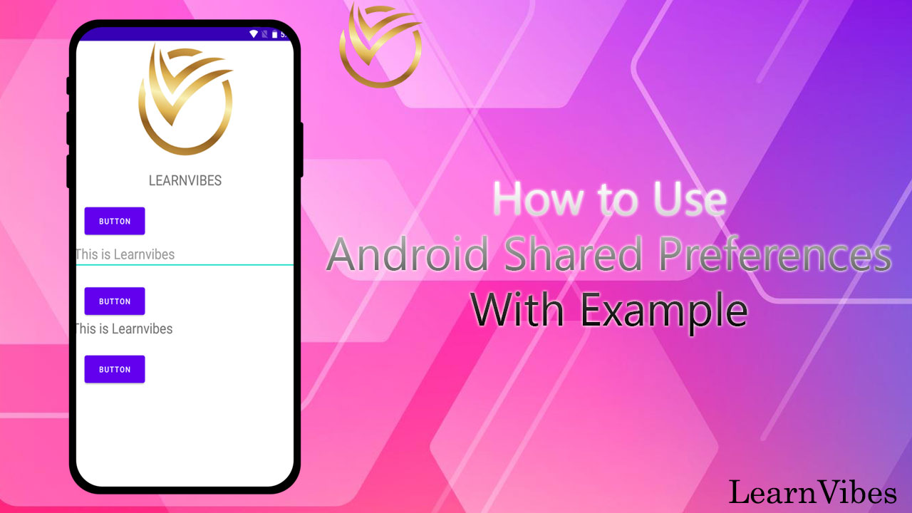
Android Shared Preferences is a simple key-value storage mechanism provided by the Android framework. It allows you to store and retrieve small amounts of data persistently across application launches. Here's how you can use Android Shared Preferences to store and retrieve key-value pairs:
Wed, 21 Jun 2023

-in-Android.jpg)