In the context of Android development with Kotlin, the "raw" folder refers to a specific directory within the "res" (resources) folder of an Android project.
It is used to store raw asset files, such as audio, video, or any other type of binary data, that you want to access in your Android application. To use the "raw" folder in Kotlin, follow these steps:
Wed, 26 Jul 2023
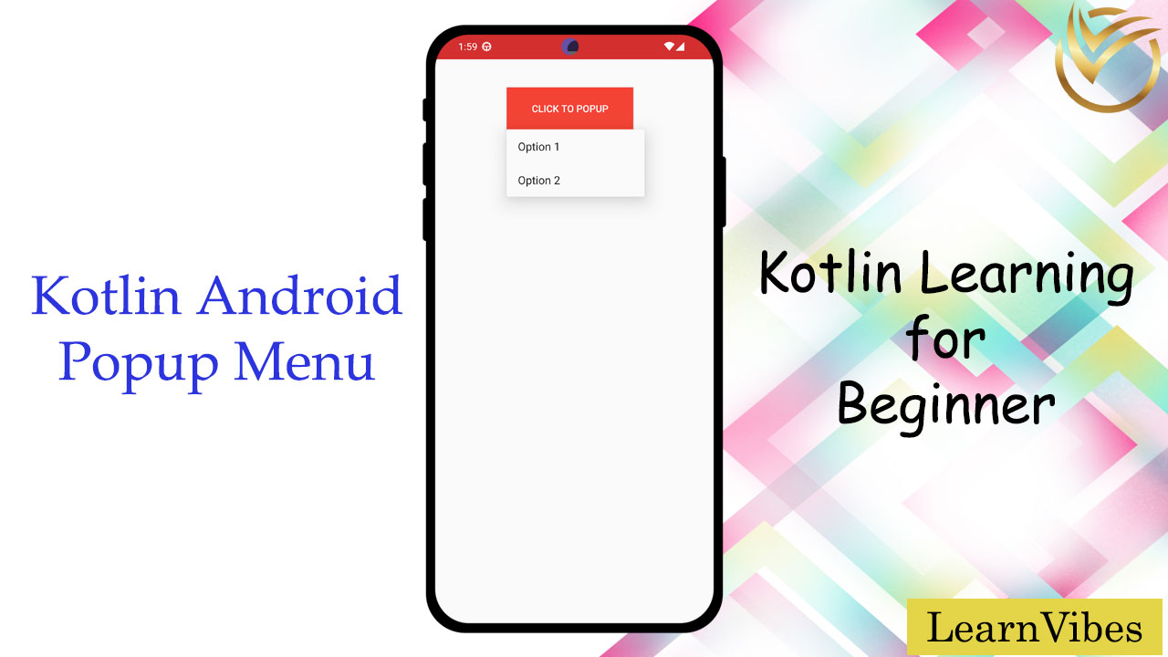
In Android, a popup menu is a UI element that displays a list of actions or options when a user triggers it, usually through a long press or a tap on a designated trigger view. Here's how you can implement a popup menu in an Android app using Kotlin:
Sun, 13 Aug 2023
In Android development using Kotlin, you can use the TimePicker widget to allow users to select a specific time. Here's how you can use the TimePicker widget in a Kotlin-based Android application:
Thu, 10 Aug 2023
Snackbars play a crucial role in enhancing user experience by displaying immediate feedback on user interactions.
In this article, we will discuss implementing custom Snackbars using Java to differentiate them from regular ones. Custom Snackbars can be designed with unique layouts and styles to match the app's branding or aesthetic.
Sun, 06 Aug 2023
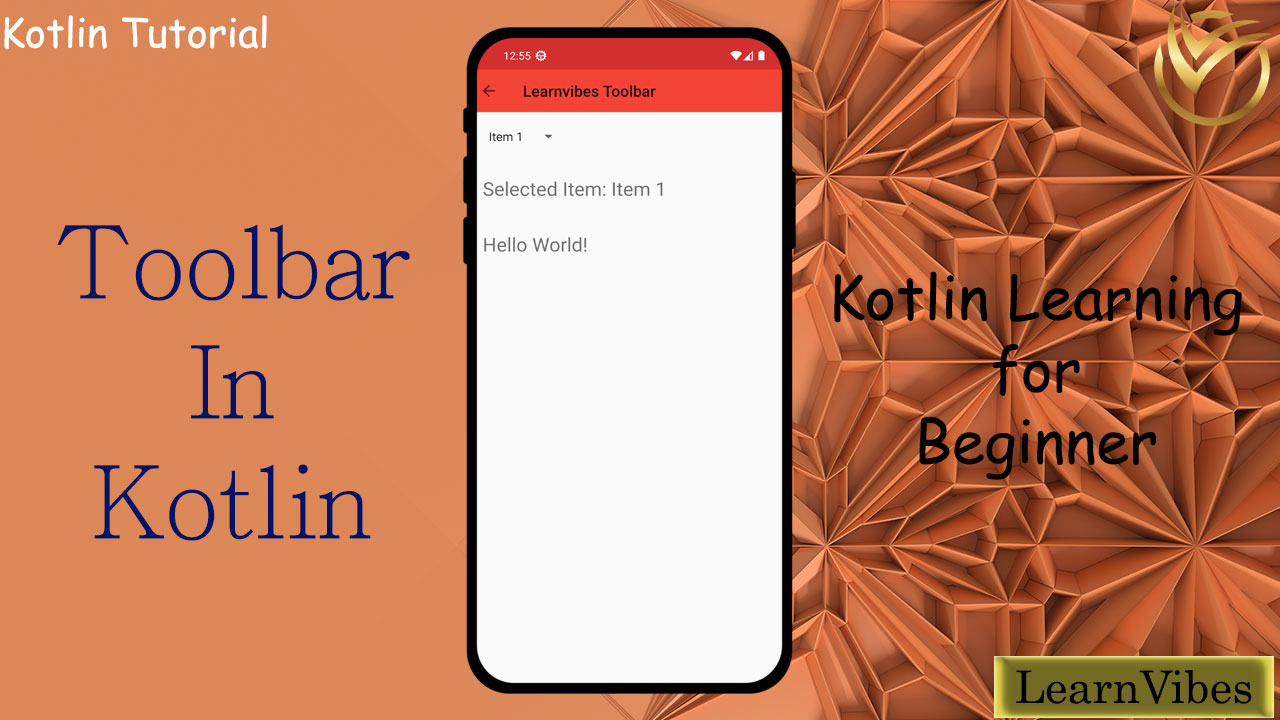
In Android development using Kotlin, you can create a toolbar using the Toolbar widget provided by the Android framework. The Toolbar widget is a versatile and customizable app bar that can be used to display various UI components, such as a title, navigation buttons, and actions. Here's how you can create a toolbar in an Android app using Kotlin:
Sat, 12 Aug 2023
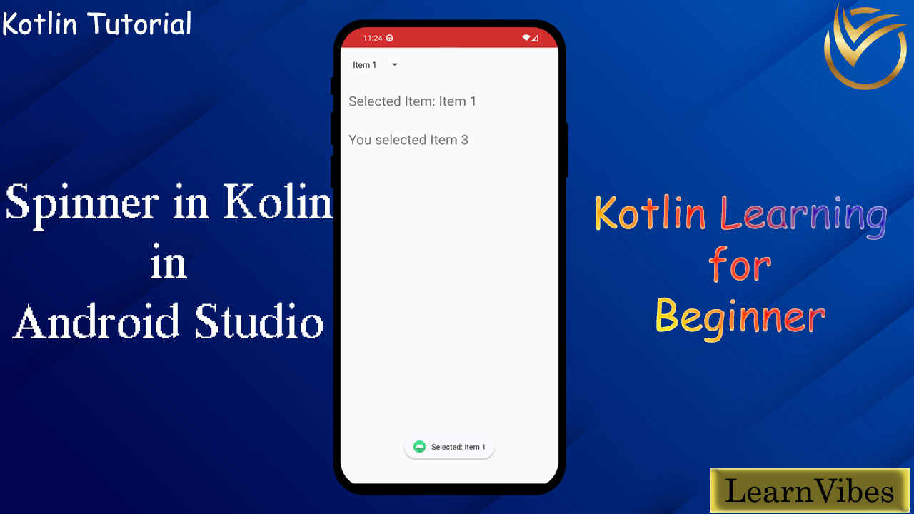
Creating a spinner in Android using Kotlin involves several steps. A spinner is a dropdown-like UI element that allows users to select an item from a list. Here's a step-by-step guide on how to create a spinner in an Android app using Kotlin:
Fri, 11 Aug 2023
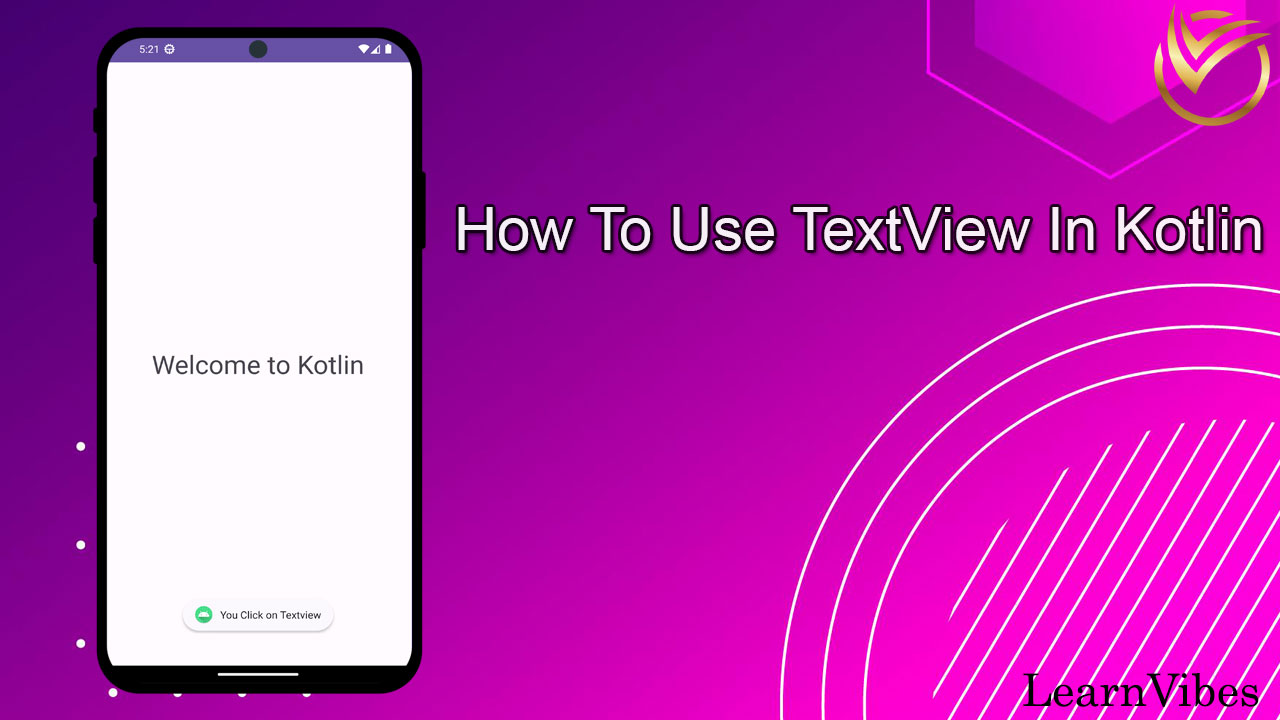
In Kotlin, TextView is a fundamental UI component used to display and manipulate text in Android applications. It is part of the Android framework and is commonly used to present textual information to the user.
Mon, 17 Jul 2023
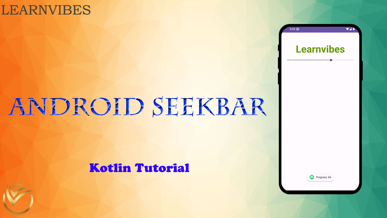
Kotlin is a popular programming language used for Android app development, and the SeekBar is a UI widget that allows users to select a value within a specified range by dragging a slider.
In Android development with Kotlin, you can easily use and customize the SeekBar widget to meet your app's requirements. Here's a step-by-step guide on how to work with the SeekBar in Kotlin for Android:
Tue, 01 Aug 2023
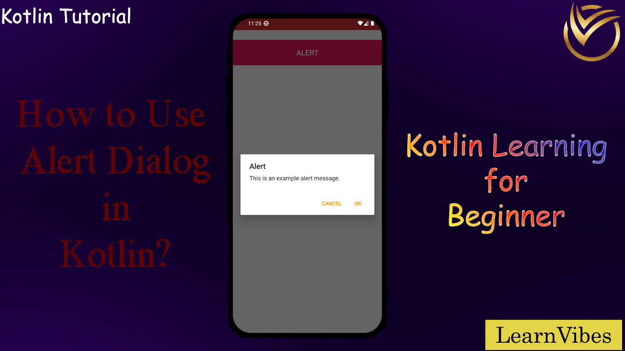
In Kotlin, you can use an AlertDialog to display a pop-up dialog with a message and optional buttons for user interaction. Here's a step-by-step guide on how to use AlertDialog in Kotlin:
Fri, 04 Aug 2023
Implementing RadioButtons in Kotlin is similar to implementing them in Java. Here's a step-by-step guide to implement Android RadioButtons in Kotlin:
Wed, 02 Aug 2023
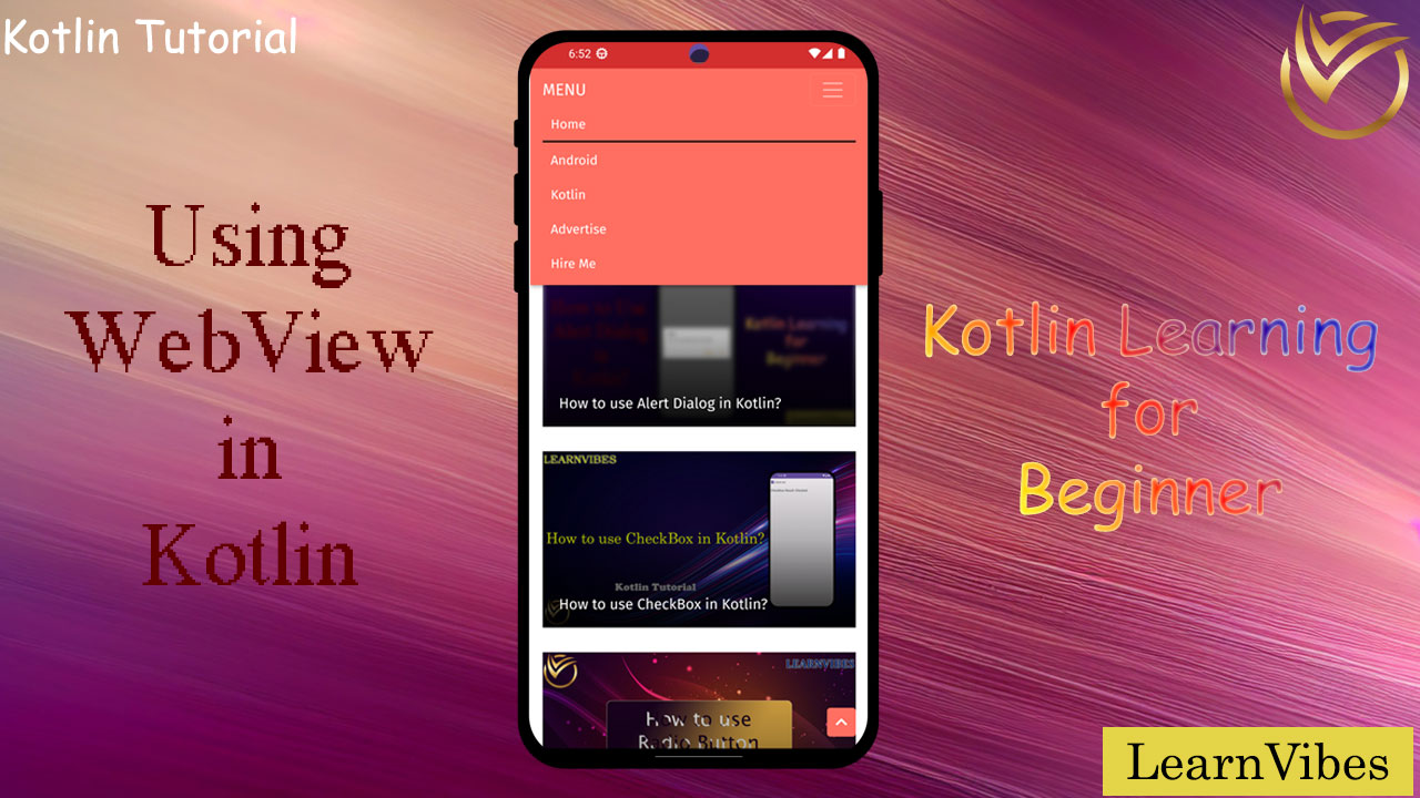
In Kotlin, you can use WebView to display web content within your Android app. WebView allows you to load web pages, show web content, and interact with JavaScript code from within your Kotlin-based Android app.
Sun, 06 Aug 2023
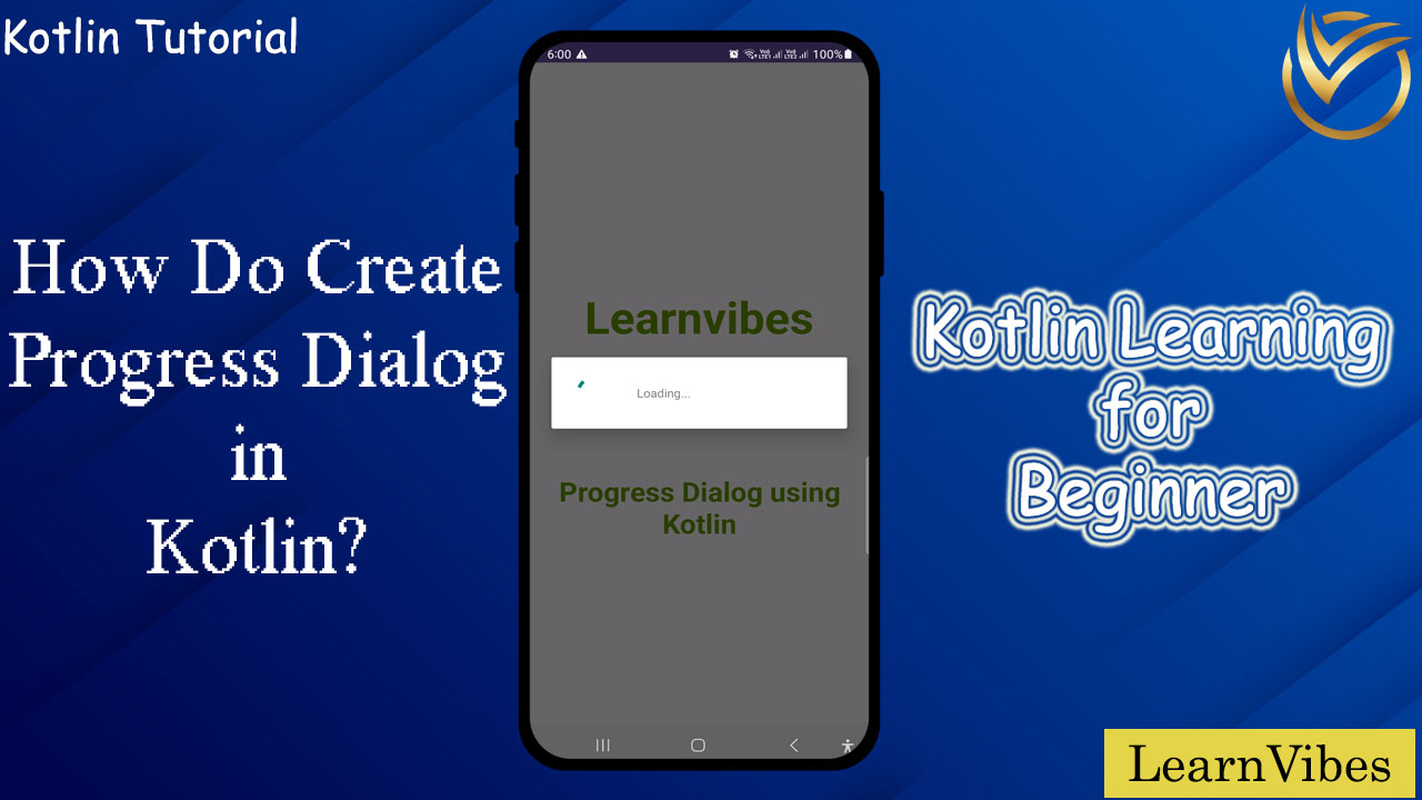
In Kotlin, you can create a progress dialog using the ProgressDialog class, which provides a built-in dialog with a spinning wheel or progress bar that indicates an ongoing operation. However, please note that ProgressDialog is now deprecated in API level 26, and it's recommended to use ProgressBar inside a custom dialog or ProgressBar in the layout of your activity/fragment.
Mon, 31 Jul 2023
To zoom an ImageView in Kotlin, you can implement a pinch-to-zoom functionality using GestureDetector and ScaleGestureDetector. Here's a step-by-step guide to achieve this:
Fri, 28 Jul 2023
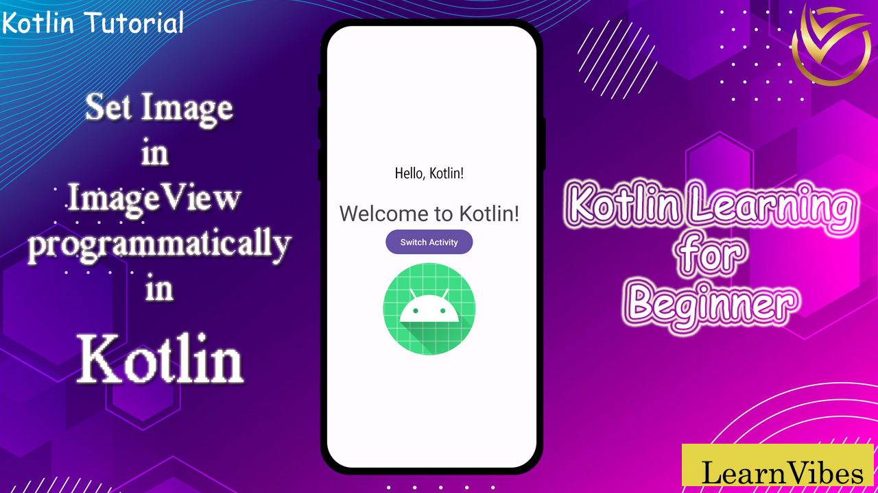
Using ImageView in Kotlin within Android Studio is quite straightforward. ImageView is a widget used to display images in Android applications. Here's a step-by-step guide on how to use ImageView:
Thu, 27 Jul 2023
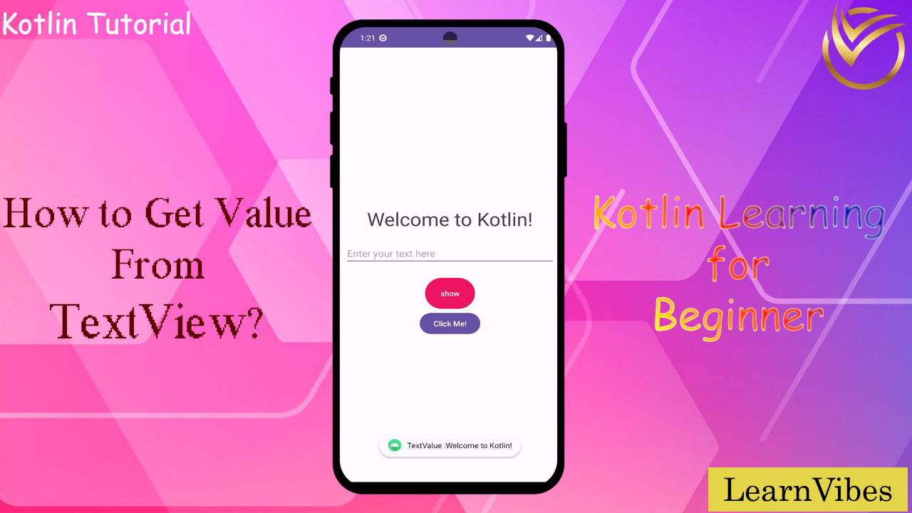
To get the value from a TextView in Android Studio using Kotlin, you can follow these steps:
Wed, 02 Aug 2023
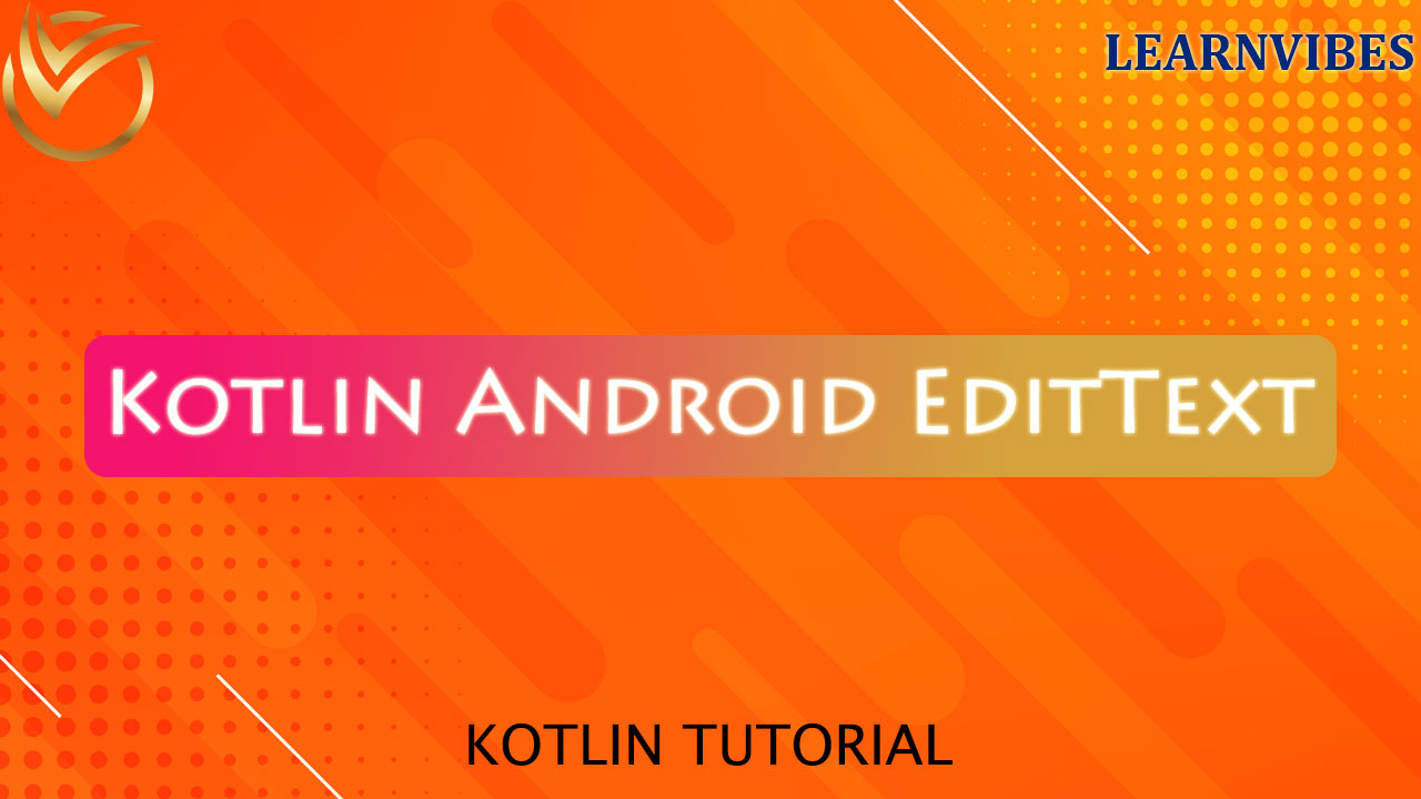
In Android development using Kotlin, the EditText is a versatile UI widget that allows users to input text. Here's a basic example of how to use EditText in a Kotlin activity:
Fri, 21 Jul 2023
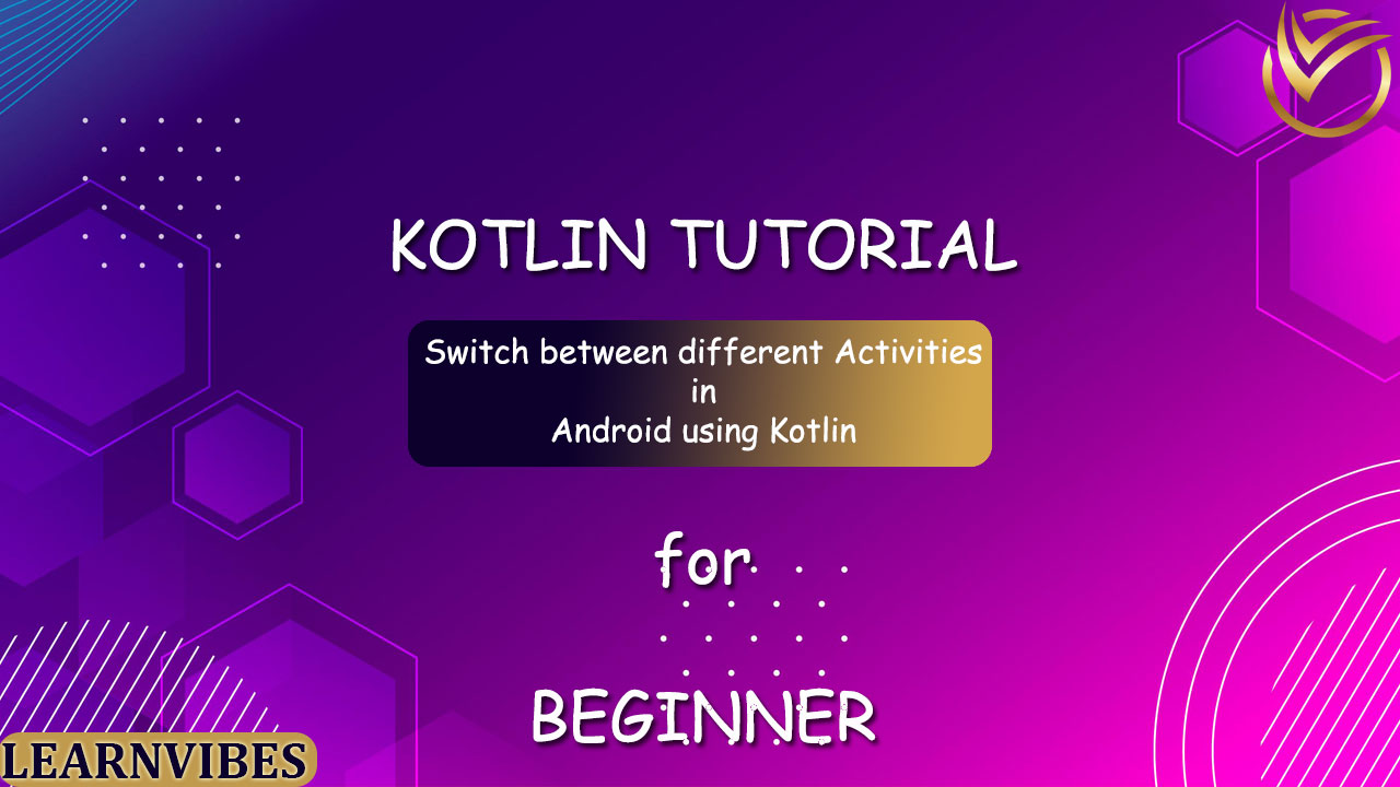
To switch between different activities in Android using Kotlin, you can follow these steps:
Wed, 19 Jul 2023
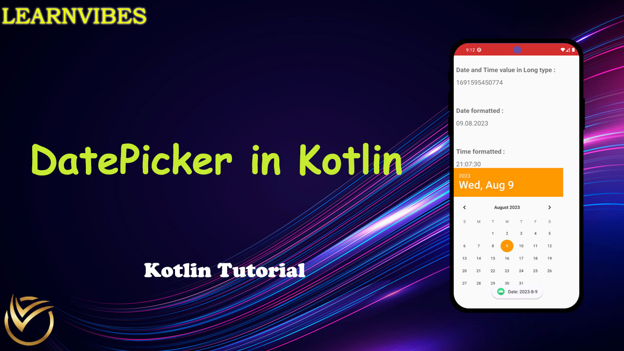
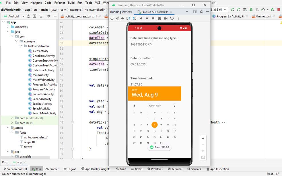
Formatting dates and times in Android involves utilizing the SimpleDateFormat library from Java. The process often begins with acquiring the current system date through a Calendar instance. This captured date and time, represented in Long data type, can then be transformed into a more user-friendly human-readable format. The following article delves into the techniques for formatting Date values into diverse formats, ultimately enabling their display in a visually understandable manner.
Thu, 10 Aug 2023
SharedPreferences is a way to store key-value pairs in Android applications, persisting data even after the app is closed. It's often used to store simple app settings, user preferences, and other lightweight data.
Tue, 15 Aug 2023
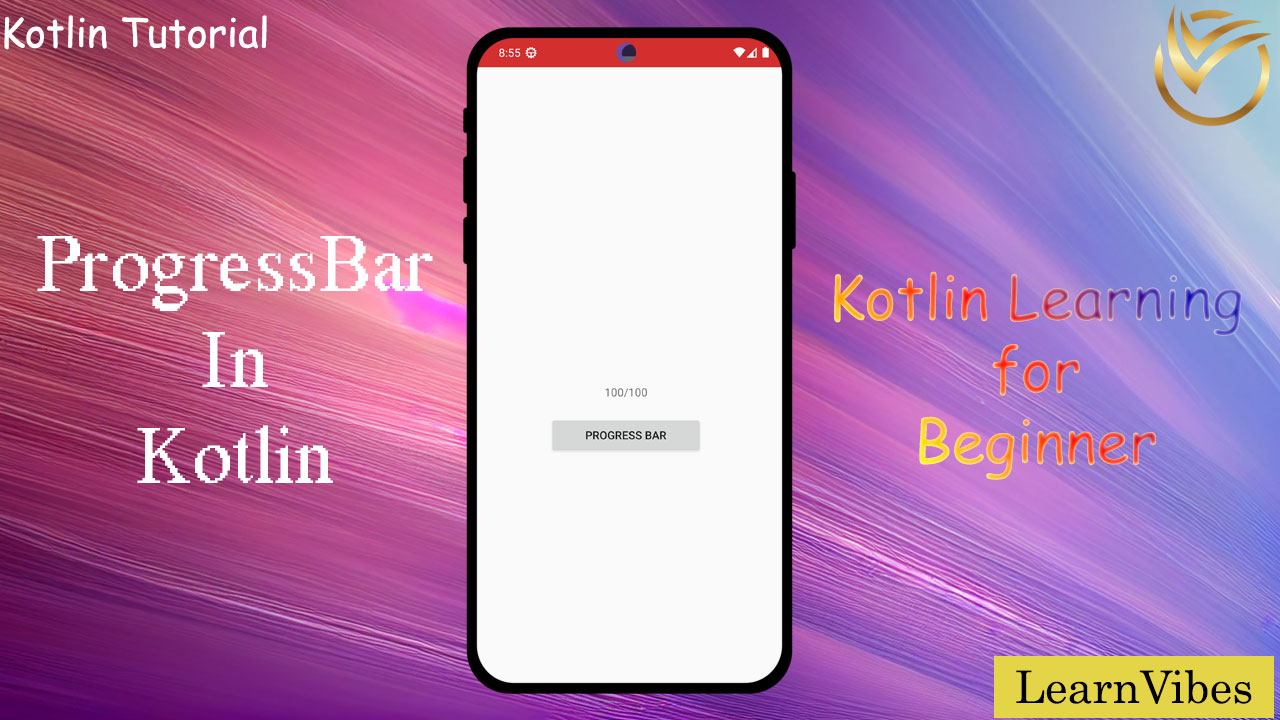
Creating a progress bar in Kotlin can be achieved using various approaches, but one common way is by using the ProgressBar widget from the Android framework, assuming you're building an Android application. Below is a step-by-step guide to creating a basic progress bar in Kotlin:
Thu, 10 Aug 2023
Creating a new Kotlin project in Android Studio is the first step in developing Android applications using the Kotlin programming language. Android Studio provides a simple and intuitive interface to help you set up a new Kotlin project. Here's an introduction to creating a new Kotlin project in Android Studio:
Sun, 16 Jul 2023
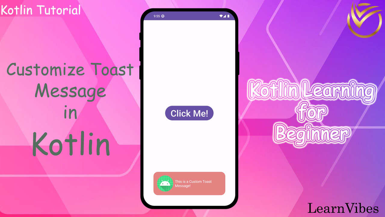
In Kotlin, you can customize the appearance and behavior of the toast message by creating a custom layout for the toast and using a Toast object with a custom view. Here's how you can customize the toast message in Kotlin:
Mon, 24 Jul 2023
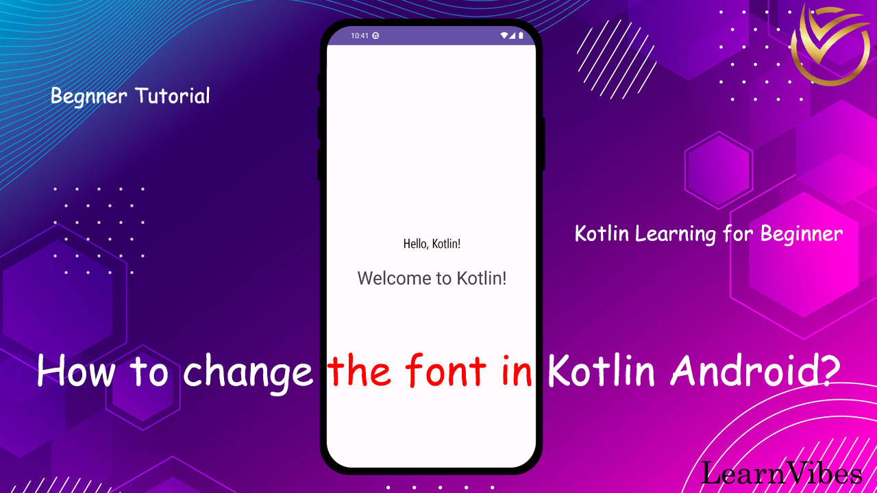
In Android app development, customizing the appearance of UI elements is essential for creating visually appealing and unique user interfaces. One common customization is changing the font of a TextView. By changing the font, you can give your app a distinct look and feel that aligns with your design vision.
We will explore how to change the font of a TextView in an Android app using Kotlin. We'll cover the necessary steps, from adding the font file to your project to programmatically applying it to TextView. Let's get started and make your app's text truly stand out!
Tue, 18 Jul 2023
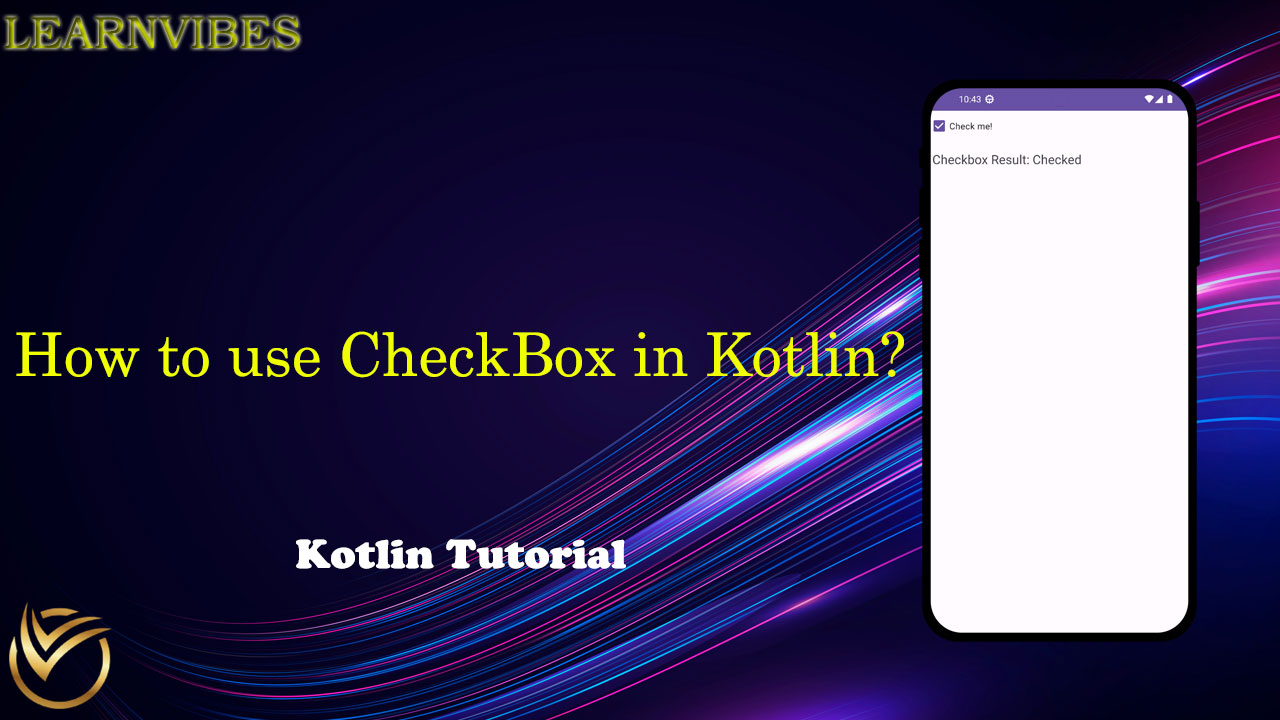
In Kotlin, there is no specific "Check Box" data type like in some other languages. However, you can use the CheckBox widget provided by Android to create and work with checkboxes in your Android applications.
Thu, 03 Aug 2023
Using buttons in Kotlin for Android is a common task when developing mobile applications. Here's a step-by-step guide on how to use a button in Kotlin for Android:
Sun, 23 Jul 2023
Creating a splash screen in an Android app is a great way to provide a visually appealing and branded start to your application.
A splash screen is usually displayed when the app is launched, giving it time to initialize and load any necessary resources in the background while presenting a graphical representation of your app's identity to the user.
Sun, 30 Jul 2023